Rotis Typeface: The Humanist Superfamily by Otl Aicher
Created in 1988 by the renowned German graphic designer and typographer Otl Aicher, Rotis is more than just a font; it is a comprehensive typeface superfamily. Aicher designed Rotis to achieve maximum legibility by creating a unified family that bridges the gap between traditional serif and modern sans-serif styles.
The core philosophy behind Rotis was to provide a seamless transition across different typographic styles while maintaining a consistent visual identity. This allows designers to mix and match variants within the same family without creating jarring visual contradictions.
Key Facts
- Designer: Otl Aicher (1988).
- Foundry: Originally released by Agfa.
- Category: Humanist sans-serif superfamily.
- Naming: Named after Rotis, a hamlet in Leutkirch im Allgäu, Germany.
- Core Variants: Serif, Semi-Serif, Semi-Sans, and Sans.
The Four Core Variants of Rotis
Rotis is structured into four distinct styles, each serving a specific aesthetic and functional purpose:
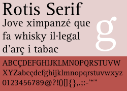
Rotis Serif (Antiqua)
The most traditional of the family, featuring full serifs (the small lines attached to the ends of letter strokes) for a classic look.
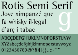
Rotis Semi-Serif (Semi-Antiqua)
A hybrid style that utilizes hinted serifs, offering a balance between traditional elegance and modern clarity.
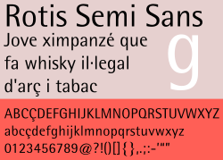
Rotis Semi-Sans (Semi-Grotesque)
This version removes serifs entirely but retains variation in stroke width, maintaining a calligraphic, humanist feel.
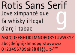
Rotis Sans (Lineale Humanist Sans-Serif)
The cleanest version of the family, featuring no serifs and minimal variation in stroke width for a streamlined, modern appearance.
Technical Evolutions and Versions
Monotype Originals and Rotis Pro
When reissued under the Monotype Originals label, the family was updated to support the ISO Adobe 2 character set and OpenType features. The Rotis Pro version expanded accessibility further, adding support for Adobe CE and Latin Extended characters, as well as dedicated fonts for Greek and Cyrillic scripts.
Rotis II Sans (2011)
Developed by Robin Nicholas and Alice Savoie, Rotis II Sans expanded the original sans-serif offering. This version introduced three new weights—Light, Semi Bold, and Black—along with revised kerning (the spacing between individual characters) and a new set of numerals aligned with the height of capital letters.
| Version/Variant | Key Characteristics | Notable Features |
|---|---|---|
| Rotis Serif | Full serifs | Classic, high legibility |
| Rotis Semi-Serif | Hinted serifs | Hybrid aesthetic |
| Rotis Semi-Sans | No serifs, varied width | Humanist feel |
| Rotis Sans | No serifs, uniform width | Modern, streamlined |
| Rotis II Sans | Expanded weights | Light, Semi Bold, Black weights |
Naming and Philosophy
The typeface takes its name from Rotis, a hamlet in the town of Leutkirch im Allgäu, where Otl Aicher resided. Interestingly, Aicher originally insisted on the name being written in minuscules (lowercase), as he viewed capital letters as symbols of hierarchy and oppression. However, when Monotype Imaging reissued the fonts in 2011, the names were capitalized to "Rotis," a change that was adopted by other foundries.
Global Applications and Usage
Rotis has been adopted by a diverse array of corporate, cultural, and governmental entities worldwide:
- Transportation: The Bilbao Metro uses Rotis for its logo and signage; Singapore uses Rotis Semi-Sans for street name signs.
- Corporate: Used by Accenture (until 2017), McAfee (until 2005), and PNC Financial Services.
- Arts & Music: Björk used the typeface for her album Homogenic; the rock band Ween used it for the album Quebec.
- Education: Used by the Vrije Universiteit Brussel, Leibniz University of Hannover, and the University of California, San Diego.
- Government: Used by the Auckland City Council for traffic signage and formerly by Australia's Centrelink.
Despite its widespread use, the typeface has faced criticism. Designer Erik Spiekermann famously argued that the letters do not always come together naturally to form words, suggesting the font is best suited for large architectural applications, such as gravestones.
Frequently Asked Questions
Who designed the Rotis typeface?
Rotis was designed by the German graphic designer and typographer Otl Aicher and released in 1988.
What makes Rotis a "superfamily"?
It is considered a superfamily because it encompasses four distinct styles—serif, semi-serif, semi-sans, and sans-serif—all designed to be visually unified and compatible.
Why was the font originally named in lowercase?
Otl Aicher used minuscules for the name "rotis" because he associated capital letters with oppression and hierarchy.
What are the differences between Rotis Sans and Rotis Semi-Sans?
While neither has serifs, Rotis Semi-Sans maintains variation in the width of the strokes, whereas Rotis Sans has minimal variation, resulting in a more uniform look.
Which famous artists have used Rotis?
The musician Björk used Rotis for the artwork of her album Homogenic and its associated singles.