Italic Type: History, Design, and Typographic Usage
In the world of typography, italic type is a cursive font based on a stylized form of calligraphic handwriting. Alongside roman and blackletter, it stands as one of the primary typefaces in Western typographic history. Characterized by a slight rightward slant and distinct glyph shapes, italics often feature swashes and flourishes in their upper-case letters, reflecting their origins in ornate calligraphy.
While often used interchangeably with slanted text, there is a technical distinction between true italics and oblique type. True italics utilize unique letterforms that differ from the standard roman version, whereas oblique type simply slants the existing roman forms without altering their structure.

Key Facts
- Origin: Developed in Italy to replace the handwritten "chancery hand."
- First Use: Introduced by Aldus Manutius in Venice around 1500.
- Original Purpose: Designed for small, portable books to suggest informality, not for emphasis.
- True Italic vs. Oblique: True italics have unique glyph shapes; oblique is a slanted version of roman type.
- Modern Usage: Commonly used for titles of ships, algebraic symbols, and internal character thoughts in fiction.
The History of Italic Type
The Venetian Beginnings
Italic type was first implemented by the humanist printer Aldus Manutius and his press in Venice in 1500. Manutius sought to replicate the style of handwritten manuscripts to create small, easily portable editions of popular works, such as poetry. This choice was intended to evoke a sense of informality suitable for leisure reading.
The type was cut by punchcutter Francesco Griffo, who modeled the letters after the handwriting of Niccolò de' Niccoli. The first brief appearance of the type was in the frontispiece of Catherine of Siena's letters in 1500, followed by its first full-volume use in a 1501 edition of Virgil.
![Catherine of Siena, Epistole ("Letters"), published in Venice by Aldo Manuzio in September 1500:[6] illustrated table in which appear the first words ever printed in italics: iesus, inside the heart in the left hand and iesu dolce iesu amore inside the book in the right hand.[7]](/images/4b/4b/4b4bf2630ea90015ff35917df6a988ed7e0fc2b55768cda493d32cb638e9fcd1.jpg)
![Aldus Manutius' italic, in a 1501 edition of Virgil. Italic is only used for the lower case and not for capitals.[1]](/images/1f/bd/1fbd454a5032bd0f96d30ef97f7507f173c66cadf9a5585f56b019fcbe6ae9a2.jpg)
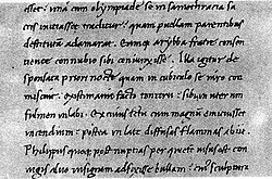
Spread and Imitation
Despite the Venetian Senate granting Manutius exclusive rights to the typeface—a patent confirmed by three Popes—the style was widely counterfeited by 1502. It spread rapidly across Europe, reaching Paris by 1512. In Italy, the characters were known as Aldino, while elsewhere they became known as Italic.
The Rise of Chancery Italics
Around 1524, a second wave known as chancery italics emerged. Introduced by Ludovico Arrighi and Giovanni Antonio Tagliente, this style was based on a more formal handwriting with longer ascenders and descenders. While this style faded by the end of the 16th century, it saw various revivals in the 20th century.
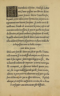
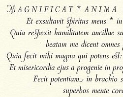
Evolution of Form and Function
Initially, italic capitals were upright. Sloped capitals were introduced in 1524 by Johann Singriener in Vienna and were later refined by the French punchcutter Robert Granjon. By the 17th century, the use of italics to denote emphasis became a standard norm. Stylistic changes continued, such as the transition in the 1690s to an open-form "h" to match the "n" in the Romain du roi typeface.
Typographic Usage and Conventions
Modern typography employs italics for specific semantic and technical purposes:
- Names of Ships: For example, The Queen Mary.
- Self-Referential Text: When a letter or number is mentioned as itself.
- Internal Monologue: In novels, to indicate a character's thoughts.
- Mathematics and Science: Algebraic symbols, constants, and variables (e.g., n = 2 or the speed of light, c).
![A common view of when to use italics and bold text. An additional option for emphasis is to use small capitals for a word or name to stand out.[32][33]](/images/f6/4a/f64a9a66a15a6a781120aa39d717c165b715836f806f0c15c73d674ac9b10605.webp)
Oblique and Alternative Slants
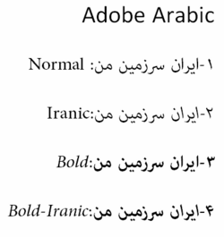
When a font family lacks a true italic, oblique type is used. While standard italics slant right, left-leaning italics (or backslanted) are rare in Latin scripts and are typically used for attention-grabbing effects or to denote irony. However, in right-to-left scripts, such as Arabic, the Iranic font style (invented by Gholamhossein Mosahab in the 1950s) uses a back-slanted form to align with the script's direction.

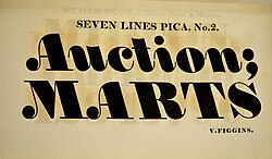
Upright Italics
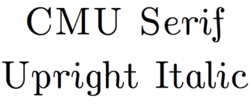
Some specialized font families, such as Jan van Krimpen's Romanée or Eric Gill's Joanna, feature upright or near-upright italics. The Bembo typeface is notable for offering both a standard italic and a more calligraphic "Condensed Italic" designed by Alfred Fairbank.
![Monotype Garamond's italic replicates the work of 17th-century punchcutter Jean Jannon quite faithfully, with a variable slant on the italic capitals.[69]](/images/f7/fb/f7fb54e9d2bcb8cef5ee02163bf80a3a8f6951f57ecccdccaee211fd49fca7cc.png)
Comparison of Typographic Styles
| Feature | True Italic | Oblique | Upright Italic |
|---|---|---|---|
| Letterforms | Unique, calligraphic shapes | Identical to Roman shapes | Calligraphic but vertical |
| Slant | Typically right-leaning | Slanted (usually right) | Vertical or near-vertical |
| Origin | Handwritten chancery hand | Mechanical slant of Roman | Specialized design revivals |
| Primary Use | Emphasis, titles, variables | Substitute for italics | Specific aesthetic choices |
![Three sans-serif italics. News Gothic, a 1908 grotesque design, has an oblique 'italic', like many designs of the period. Gothic Italic no. 124, an 1890s grotesque, has a crisp true italic resembling Didone serif families of the period.[46] Seravek, a modern humanist family, has a more informal italic in the style of handwriting.](/images/cb/69/cb6971013ef30c124de5e76a19f13c835065f76de58e3e3b7dfc75f0cb313e79.png)

Frequently Asked Questions
What is the difference between italic and oblique type?
True italics are designed with unique letterforms based on calligraphy, whereas oblique type is simply a slanted version of the regular roman typeface without any change to the glyph shapes.
Who invented italic type?
Italic type was first used by Aldus Manutius in Venice around 1500, with the actual cutting of the type performed by his punchcutter Francesco Griffo.
Why were italics originally created?
They were not originally intended for emphasis. Instead, they were designed to mimic handwriting for use in small, portable books to give them a more informal, leisure-reading feel.
When should I use italics in scientific writing?
Italics are conventionally used for algebraic symbols, variables, and physical constants, such as the symbol c for the speed of light.
What are left-leaning italics used for?
In Latin scripts, they are rare and used for attention-grabbing effects or to suggest irony. In Arabic scripts, back-slanted forms (Iranic style) are used to match the right-to-left direction of the writing.