The Evolution of Italic Type: From Calligraphy to Digital Design
In the world of typography, italic type is a cursive font style derived from stylized calligraphic handwriting. Along with blackletter and roman type—the standard upright typeface—italics represent one of the most significant developments in the history of Western printing. Because of their calligraphic roots, italics typically slant slightly to the right and feature unique glyphs (the specific shapes of individual characters) that differ from their roman counterparts. In some cases, uppercase letters may even include decorative flourishes known as swashes.
![Aldus Manutius' italic, in a 1501 edition of Virgil. Italic is only used for the lower case and not for capitals.[1]](/images/1f/bd/1fbd454a5032bd0f96d30ef97f7507f173c66cadf9a5585f56b019fcbe6ae9a2.jpg)
The history of italics is deeply tied to the handwriting of the Renaissance. The style was heavily influenced by the handwriting of Niccolò de' Niccoli, which served as a model for early type designers seeking to replicate the fluid motion of a pen.
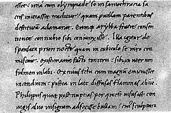
The first major milestone in italic printing occurred in Venice around 1500. The printer and humanist Aldus Manutius introduced italic type not for emphasis, but to create small, portable editions of popular books, such as poetry. By mimicking the informal style of handwritten manuscripts, Manutius made these books more convenient for leisure reading. The typeface was cut by the skilled punchcutter (a person who carves the metal molds used to create type) Francesco Griffo.
![Catherine of Siena, Epistole ("Letters"), published in Venice by Aldo Manuzio in September 1500:[6] illustrated table in which appear the first words ever printed in italics: iesus, inside the heart in the left hand and iesu dolce iesu amore inside the book in the right hand.[7]](/images/4b/4b/4b4bf2630ea90015ff35917df6a988ed7e0fc2b55768cda493d32cb638e9fcd1.jpg)
The Rise of Chancery Italics
As the popularity of italics grew, a second wave of design emerged known as "chancery" italics. Introduced around 1524 by calligraphers like Ludovico Arrighi and Giovanni Antonio Tagliente, this style was more formal and deliberate. Chancery italics often featured longer ascenders and descenders (the parts of a letter that extend above or below the main body) and were frequently used in larger print sizes.
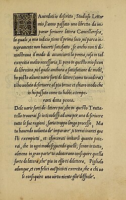
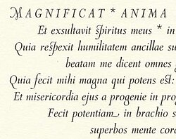
While the dominance of the chancery style faded during the 16th century, it saw significant artistic revivals in the 20th century, maintaining its elegant, calligraphic legacy in modern type design.
Understanding True Italics vs. Oblique Type
A common point of confusion in modern typography is the distinction between "true italics" and "oblique" type. True italics are designed with entirely different letterforms that mimic cursive writing. For example, a true italic "a" or "f" will look distinctly different from its roman version.

In contrast, oblique type is simply a slanted version of the roman typeface. In oblique styles, the letterforms remain the same, but the entire character is tilted to the right. This is often used in sans-serif fonts where a dedicated cursive italic design might feel out of place.

In professional typesetting, italics are used to provide emphasis, identify creative works, cite foreign phrases, or indicate which words a speaker stressed in a quote. One common way to think of italics is as the printed equivalent of underlining a word in a manuscript.
![A common view of when to use italics and bold text. An additional option for emphasis is to use small capitals for a word or name to stand out.[32][33]](/images/f6/4a/f64a9a66a15a6a781120aa39d717c165b715836f806f0c15c73d674ac9b10605.webp)
In many modern sans-serif families, what is labeled as "italic" is actually an oblique design. Designers sometimes prefer this because true italics can occasionally appear "too soft" or organic for the clean aesthetic of a sans-serif font.
![Three sans-serif italics. News Gothic, a 1908 grotesque design, has an oblique 'italic', like many designs of the period. Gothic Italic no. 124, an 1890s grotesque, has a crisp true italic resembling Didone serif families of the period.[46] Seravek, a modern humanist family, has a more informal italic in the style of handwriting.](/images/cb/69/cb6971013ef30c124de5e76a19f13c835065f76de58e3e3b7dfc75f0cb313e79.png)
Specialized and Complex Uses
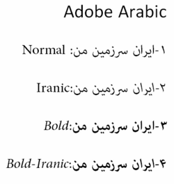
Typography also accommodates specialized scripts. For example, in right-to-left scripts like Arabic, "left-leaning" or back-slanted italics have been developed to complement the direction of the text.

This back-slanted approach is often used for attention-grabbing effects or to denote specific linguistic nuances in certain font families.
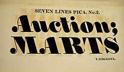
Modern digital fonts, such as Adobe Arabic, provide specific support for these varied directions and styles.
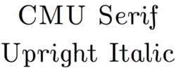
In other contexts, such as mathematics or complex technical writing, "upright italics" may be used. These maintain a cursive style but remain vertical, allowing for clear distinction when a text is already heavily italicized.
Whether used in a classic serif font like Monotype Garamond or a modern mathematical set, the versatility of the italic style remains a cornerstone of clear communication.
![Monotype Garamond's italic replicates the work of 17th-century punchcutter Jean Jannon quite faithfully, with a variable slant on the italic capitals.[69]](/images/f7/fb/f7fb54e9d2bcb8cef5ee02163bf80a3a8f6951f57ecccdccaee211fd49fca7cc.png)
Key Facts
- Origin: Italics were first used by Aldus Manutius in Venice around 1500.
- Purpose: Originally designed for small, portable, and informal books like poetry.
- True Italic vs. Oblique: True italics change the shape of the letters; oblique type simply slants the existing letters.
- Scientific Use: Italics are standard for algebraic symbols, physical quantities, and biological gene names.
- Literature Use: Used for titles of standalone works like books, movies, and paintings.
| Feature | True Italic | Oblique Type |
|---|---|---|
| Letterforms | Distinct, cursive-inspired shapes | Slanted versions of roman shapes |
| Aesthetic | Organic and calligraphic | Keen, insistent, or geometric |
| Common Usage | Serif body text and emphasis | Sans-serif fonts and display type |
Frequently Asked Questions
What is the main difference between italics and oblique type?
The primary difference lies in the letterforms. True italics feature unique, cursive-style shapes for many letters (such as a different "a" or "f"), whereas oblique type is simply the standard roman typeface slanted to the right without changing the character shapes.
Why were italics originally created?
Aldus Manutius introduced italics to create smaller, more affordable, and portable editions of books. The calligraphic style allowed for a more informal feel, making them ideal for leisure reading and poetry.
How should I format a book title that appears inside an italicized sentence?
When a title (which is normally italicized) appears within a sentence that is already in italics, you should switch the title back to roman (upright) type to ensure it remains distinguishable.
Are italics used in scientific and mathematical writing?
Yes. In mathematics, algebraic symbols, constants, and variables are conventionally set in italics. In biology, gene names are written in italics, while the proteins they code for are written in roman type.
What can I use if italics are not available?
In environments that do not support italics, such as typewriters or certain plain-text digital formats, common substitutes include underlining, using quotation marks, or using underscores.