Frederic Goudy and the Art of American Metal Type
Frederic Goudy stands as one of the most influential figures in the history of American typography. As the third most prolific designer of metal type in the United States—surpassed only by Morris Fuller Benton and R. Hunter Middleton—Goudy left an indelible mark on the printed word. With ninety faces actually cut and cast, and numerous other completed designs, his work bridged the gap between traditional craftsmanship and the industrial demands of early 20th-century printing.
Goudy's approach was deeply rooted in the Arts and Crafts movement and the rise of fine book printing. During an era when type design had become increasingly mechanical and geometric—driven by Didone designs like Bodoni—Goudy sought a return to warmth and irregularity. He drew heavy inspiration from the calligraphy and printing of the Italian Renaissance, as well as hand-painted signs, to create old-style serifs that felt human and organic.
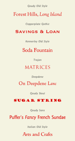
Key Facts
- Prolific Output: Designed 90 cut and cast metal typefaces.
- Famous Works: Best known for Goudy Old Style and Copperplate Gothic.
- Stylistic Focus: Specialized in old-style serifs influenced by the Italian Renaissance and medieval manuscripts.
- Technological Aid: Utilized pantograph engraving to rapidly cut matrices (moulds for metal type).
- Academic Legacy: Created the University of California Old Style and the Sherman typeface.
Design Philosophy and Evolution
While Goudy is primarily associated with serif faces, his portfolio was diverse. He explored various aspects of the genre, from the strikingly upright italic of Deepdene to Goudy Modern, which blended traditional old-style letters with the horizontal serifs characteristic of 18th and 19th-century Didone faces. Goudy Old Style, one of his most enduring creations, was even offered with a swash italic for display purposes.
Though he generally avoided sans-serif designs, he produced a few notable exceptions. Early in his career, he created Copperplate Gothic, a nearly sans-serif face inspired by engraved letters. Later, he developed Goudy Sans, an eccentric humanist style featuring a calligraphic italic. While Goudy Sans was unpopular during his lifetime, it has seen several revivals in the modern era.
Influence of Technology and Patronage
Goudy operated as an independent artist and consultant, which required him to be entrepreneurial. He sought patronage from companies that needed custom typefaces for advertising and printing, and he promoted his expertise through teaching and public speaking. This necessity for diverse commissions is why some of his designs may appear similar to modern eyes.
His productivity was significantly boosted by pantograph engraving, a technology that allowed for the rapid cutting of matrices. This was a major leap forward from the traditional method of manually cutting punches at the exact size of the letter. Additionally, the emergence of hot metal typesetting increased the overall market demand for new fonts, providing a fertile environment for Goudy's career.
Critical Reception and Legacy
Goudy's work was not without its critics. The printer Daniel Berkeley Updike and Goudy's own student, Dwiggins, suggested his work lacked "snap and acidity," with Updike claiming Goudy never moved past his desire to imitate medieval books. Similarly, Stanley Morison of Monotype privately remarked that Goudy's types looked "peculiar" compared to the more neutral and practical approach of Times New Roman.
In his later years, Goudy felt the tide of design shifting toward modernism and sharp geometric forms, which pushed his organic style out of favor. Typographer Walter Tracy later noted that Goudy's preference for the tilted center 'e'—a common feature of 15th-century printing—introduced an "unwanted restlessness" to his designs.
Notable Institutional Typefaces
Goudy's legacy continues through specific institutional commissions. In 1938, he designed University of California Old Style exclusively for the University of California Press. This design later evolved into the Californian font (released by Lanston Monotype in 1956) and the expanded Berkeley Old Style (created by ITC in 1983).
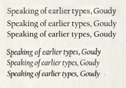
Another significant discovery occurred at Syracuse University, where curator William T. LaMoy found matrices for a 1910 font called Sherman, commissioned by publisher Frederic Fairchild Sherman. After being bequeathed to the university in the 1960s, the typeface was recently digitized as the Sherman Serif Book, now used for official university publications.
| Typeface Name | Style/Category | Key Characteristic |
|---|---|---|
| Goudy Old Style | Old-style Serif | Warmth, irregularity, and swash italics |
| Copperplate Gothic | Nearly Sans-serif | Inspired by engraved lettering |
| Goudy Sans | Humanist Sans-serif | Eccentric style with calligraphic italic |
| Deepdene | Old-style Serif | Strikingly upright italic |
| University of California Old Style | Proprietary Serif | Basis for Californian and Berkeley Old Style |
| Sherman | Proprietary Serif | Digitized as Sherman Serif Book for Syracuse University |
Frequently Asked Questions
What makes Goudy's typefaces different from Didone designs?
Unlike the mechanical and geometric precision of Didone designs like Bodoni, Goudy's typefaces emphasized warmth, irregularity, and a calligraphic quality inspired by the Italian Renaissance.
How did pantograph engraving help Frederic Goudy?
Pantograph engraving allowed Goudy to cut matrices (the moulds used to cast metal type) much more rapidly than the traditional method of manually cutting punches at the final print size.
Was Goudy Sans popular when it was first released?
No, Goudy Sans was unpopular during Goudy's lifetime, though it has been revived several times since his death.
What is the relationship between University of California Old Style and Berkeley Old Style?
University of California Old Style was the original proprietary design; Berkeley Old Style (or ITC Berkeley) is a later adaptation and expansion of that original typeface created by ITC in 1983.
What was the "Sherman" typeface discovery?
Curator William T. LaMoy discovered original matrices and paperwork for the Sherman font, commissioned in 1910, in the Syracuse University archives. This led to the creation of the digitized Sherman Serif Book.