The Art and Science of Cartography: A Comprehensive Guide to Maps
At its core, a map is a two-dimensional representation of the Earth's surface. It provides a spatial layout of geographical features, allowing us to visualize the world around us. However, modern cartography—the science and art of making maps—goes far beyond simple drawings. Maps can incorporate complex thematic information, such as demographic, economic, environmental, or socio-economic data, turning a simple image into a powerful tool for analysis.
Whether you are navigating a new city, a pilot flying through clouds, or a scientist studying seismic activity, maps are the essential interface between human understanding and the physical world.
Key Facts

- Purpose: Maps serve diverse roles, from route planning and military intelligence to scientific data organization and government administration.
- Distortion: Because the Earth is a sphere and maps are flat, every map projection introduces some level of distortion.
- Specialized Maps: Maps used for air or water navigation are specifically referred to as charts.
- Design Elements: Critical design decisions include scale, coordinate systems, symbology, color, and typography.
- Modern Technology: Contemporary cartography relies heavily on remote sensing (data from satellites or aircraft) and Geographic Information Systems (GIS).
The Evolution of Mapping
Antiquity to the 15th Century
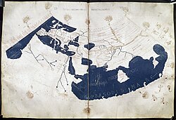
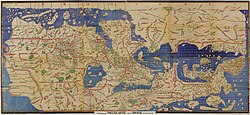
The history of cartography stretches back to antiquity. Early efforts to represent the world were foundational, such as the 2nd-century works of Ptolemy. As civilizations grew, so did the sophistication of their maps. For example, the 12th-century Tabula Rogeriana by Muhammad al-Idrisi represented some of the most advanced geographic knowledge of its era.
The 16th Century to the Present
The Renaissance brought a revolution in mapmaking. One of the most significant milestones was the creation of the Mercator projection in 1569 by Gerardus Mercator. While widely used for centuries, this projection has faced criticism because it distorts the size of landmasses, often making European nations appear much larger than developing countries near the equator.


How Maps are Designed
Creating a professional map requires a series of technical and aesthetic decisions. A cartographer must balance accuracy with readability through several key processes:
Scale and Generalization
Map scale determines the relationship between a distance on the map and the actual distance on the ground. Because it is impossible to show every single detail on a small-scale map, cartographers use generalization—a process of simplifying or omitting certain features to maintain clarity.

Projections and Coordinate Systems
Since we cannot flatten a sphere without stretching it, cartographers use projections. Every projection involves a trade-off; you might preserve shape but lose area, or vice versa. To visualize these errors, mathematicians use Tissot's indicatrix, a method of showing how much a projection distorts shapes and sizes.

To pinpoint exact locations, maps use coordinate systems. While many systems use degrees of latitude and longitude, others, like the Universal Transverse Mercator (UTM), use meters to measure XY positions, providing a highly accurate grid for specific zones.

Symbology, Color, and Typography
Visual communication is achieved through symbology (the use of icons and shapes) and color. For instance, in a topographic map, elevation is often shown via contour lines, forests are represented by green regions, and water is shown in blue.

Typography—the style and placement of text—is equally vital. Rules of cartographic design dictate that text should be legible, should not interfere with important graphical lines, and should be placed entirely on the feature it describes (e.g., a name should be entirely on land or water, not straddling both).


Modern Mapping Technologies
Remote Sensing and Imagery
Modern maps are often built from remote sensing data—information collected from a distance using satellites or aircraft. This includes orthophotos, which are aerial photographs geometrically corrected so that the scale is uniform, much like a map.


Digital Data and Databases
Today, much of our mapping is digital. Georeferencing is the process of taking an image or drawing and assigning it real-world coordinates so it can be layered accurately onto other maps. To manage the massive amounts of data in cartographic databases, technologies like R-tree indexes are used to help computers quickly locate specific geographic information.


Applications of Cartography
Maps are utilized across almost every sector of human society:
- Navigation: Pilots use aeronautical charts, while mariners rely on nautical charts to navigate seas safely.
- Government: Authorities use maps for the census, defining electoral districts, property taxation, and coordinating disaster relief.
- Military: Commanders use maps for mission planning, surveillance, logistics, and intelligence analysis.
- Science: Researchers in geology, meteorology, and seismology use spatial maps to organize and interpret complex data.


Specialized Map Types
Beyond standard reference maps, cartographers create specialized versions like cartograms, where the size of a geographic area is distorted to represent a specific variable, such as population.

| Map Category | Primary Use | Key Feature |
|---|---|---|
| Nautical/Aeronautical Charts | Navigation | Specialized for water or air travel |
| Topographic Maps | Terrain Analysis | Uses contour lines to show elevation |
| Thematic Maps | Data Visualization | Focuses on specific topics (e.g., demographics) |
| Cartograms | Statistical Emphasis | Distorts area to show variables like population |
| Orthophotos | Visual Reference | Corrected aerial imagery used as a map base |
Frequently Asked Questions
What is the difference between a map and a chart?
While the terms are often used interchangeably, in professional contexts, "charts" specifically refer to maps used for navigation, such as aeronautical charts for pilots or nautical charts for mariners.
Why do some maps make countries look larger than they are?
This is caused by map projection. Because it is mathematically impossible to flatten a sphere onto a 2D surface without distortion, certain projections (like the Mercator projection) enlarge areas near the poles while shrinking areas near the equator.
What is georeferencing?
Georeferencing is the process of taking a digital image or a drawing and assigning it specific geographic coordinates. This allows the image to be placed accurately within a larger coordinate system or layered on top of other maps.
How do scientists use maps?
Scientists use maps to organize and visualize spatial data. This is crucial in fields like geology, meteorology, and seismology, where the location of an event (like an earthquake or a weather pattern) is just as important as its intensity.
What is the purpose of contour lines on a map?
Contour lines are used in topographic maps to represent elevation. They connect points of equal height, allowing the reader to visualize the shape and steepness of the terrain.