Text Typefaces: The Art and Science of Typographic Design
In the world of professional publishing, the ideal text is composed to create a readable, coherent, and visually satisfying block of type. When executed correctly, typography works invisibly; the reader focuses on the content without becoming aware of the characters on the page. The goal is to achieve clarity and transparency through the even distribution of material, minimizing distractions and anomalies.
The choice of typeface—the specific design of the characters—is the primary aspect of text typography. Different genres of writing, from prose fiction and scientific papers to religious and commercial texts, require different typographic characteristics to effectively communicate their message.
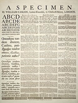
The Evolution and Application of Typefaces
For historical materials, typographers often select typefaces based on established historical genres. In contemporary publishing, books are frequently set with text romans or book romans. These are serif typefaces (characters with small decorative strokes at the ends of lines) that echo modern design arts while remaining rooted in traditional models created by masters such as Nicolas Jenson, Francesco Griffo, and Claude Garamond.
Other media have more specialized requirements:
- Newspapers and Magazines: These rely on compact, tightly fitted serif styles designed for maximum flexibility, legibility, and efficient use of limited page space.
- Sans Serif Typefaces: These lack serifs and are commonly used for introductory paragraphs, incidental text, or short articles. A common late-twentieth-century trend involves pairing a sans-serif typeface for headings with a matching high-performance serif typeface for the body text.
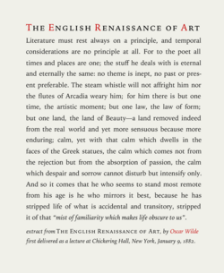
Cultural and Linguistic Influences
Typesetting is not universal; it is modulated by orthography, linguistics, morphology, and syntax. Cultural conventions also play a role. For example, French typesetting customarily inserts a non-breaking space before a colon (:) or semicolon (;), a practice not followed in English.
Understanding Typographic Color
In typography, color does not refer to hue, but to the overall density of ink on the page. This is determined by the typeface, word spacing, margins, and leading (the vertical space between lines of text). The interplay between the set text and the white space of the page creates a "resonance" or feel. For printed media, this also involves considerations of paper selection, printing methods, and binding margins.
Principles of the Typographic Craft
The craft of typography rests on three fundamental pillars: legibility, readability, and aesthetics. While often used interchangeably in casual conversation, they have distinct technical meanings.
Legibility: The Perception of Characters
Legibility refers to how easily individual characters can be distinguished from one another. It is the quality of being decipherable. For example, if a reader struggles to tell a 'b' from an 'h' or a '3' from an '8' at small sizes, the typeface lacks legibility. Factors that reduce legibility include the use of brush scripts or the exclusive use of uppercase letters (all-caps).
Readability: The Comprehension of Text
Readability refers to how easy it is to read the text as a whole. While legibility is about perception, readability is about comprehension. It is influenced by margins, line spacing, and document structure. Even a legible typeface can become unreadable if the setting and placement are poor.
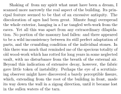
The Science of Reading
Research into readability has highlighted the importance of the saccadic rhythm—the way the eye jumps across a line. The human eye typically recognizes groups of about three words at once. If a line requires more than three or four of these jumps, it can cause eye strain and reading errors, such as doubling. This is why all-caps text is difficult to read; it removes the distinct word shapes (known as Bouma) created by ascending and descending lowercase letters, forcing the eye to parse each letter individually.
Key Facts
- Legibility focuses on individual character recognition, while readability focuses on the ease of understanding the entire text.
- Typographic Color refers to the ink density on a page, not the actual color of the ink.
- Saccadic Rhythm is the eye's movement pattern; too many jumps per line can lead to reader fatigue.
- Serif typefaces are generally preferred for long-form prose to enhance readability.
- Word Shape (Bouma) allows readers to recognize words by their outline rather than reading letter-by-letter.
Typographic Standards in Periodicals
Periodicals use style guides to standardize a small collection of typefaces, ensuring consistency in size, case, and weight. Some high-profile publications, such as The Guardian and The Economist, commission custom typefaces for exclusive use.
| Publication | Typographic Style | Key Characteristics |
|---|---|---|
| USA Today | Modern & Bold | Variety of typefaces, wide range of sizes, colorful backgrounds. |
| The New York Times | Traditional | Fewer colors, limited typeface variation, more columns. |
The Purpose of Typography
Typography serves two primary roles: characterizing the text and making reading practical.
To characterize text, a typographer must understand the author's intended mood and context. For instance, a serious topic like "Commercial Real Estate Transactions" warrants a serif typeface to convey professionalism and seriousness. Conversely, overly decorative elements or excessive colors can be unsettling and distract from the message.
Ultimately, the goal is to make the reading experience useful. While aesthetics are important—such as a 2020 study finding that round typefaces on CD covers made music sound "more pleasant"—the primary responsibility of typography is to sustain the reader's attention and ensure the message is conveyed without effort.
Frequently Asked Questions
What is the difference between legibility and readability?
Legibility is the ability to distinguish individual characters (perception), whereas readability is the ease with which a reader can comprehend the text as a whole (comprehension).
How does "typographic color" affect a page?
Typographic color is the overall density of ink. It creates the "feel" or resonance of the page through the balance of typeface, spacing, and white space.
Why is all-caps text harder to read?
All-caps text eliminates the unique outlines (Bouma) created by lowercase letters, removing the eye's ability to recognize words as groups and requiring more effort to separate characters.
What are "text romans"?
Text romans are serif typefaces designed specifically for body text in books, often based on traditional models from designers like Garamond and Jenson.
How does the saccadic rhythm impact design?
The eye reads in jumps (saccades). If a line of text is too long, requiring more than three or four jumps, the reader may experience strain or make errors.