Merrymount Press: The Legacy of Daniel Updike's Fine Printing
For 56 years, the Merrymount Press stood as a beacon of typographic excellence in New England. While the press sustained its daily operations through the production of ephemera—short-lived printed materials such as advertisements, letterheads, and dinner invitations for local businesses—it earned its lasting reputation through the creation of exquisite, finely printed books. Under the direction of Daniel Updike, the press transitioned from a local commercial shop to one of the most distinguished printing houses in the region.
Key Facts
- Founder: Daniel Updike, who left Riverside Press to establish Merrymount.
- Defining Work: The 1930 Book of Common Prayer is widely considered the press's finest achievement.
- Key Collaborations: Long-term partnerships with author Edith Wharton and the Limited Editions Club.
- Typographic Evolution: Moved from the heavy Arts and Crafts style of the Merrymount typeface to cleaner, more practical designs like Janson.
- Recognition: Named one of the American Institute of Graphic Arts Fifty Books of the Year in 1931.
Foundational Works and Early Typography
The establishment of Merrymount Press was catalyzed by the commission of the Altar Book. Begun in 1893 and completed in 1896 with financing from Harold Brown, this project gave Updike the courage to leave his position at Riverside Press. The Altar Book featured the proprietary Merrymount typeface, designed in 1895 by Bertram Grosvenor Goodhue. This typeface was inspired by the Arts and Crafts style of William Morris, though Updike later critiqued these "unduly black types" for being too heavy. Following this project, Updike shifted toward a cleaner, more functional aesthetic, reserving the heavy Merrymount type only for large-scale pages.
During the preparation of the Altar Book, Updike arranged Vexilla Regis Quotidie (1893), a collection of daily prayers and hymns compiled by Lucy Bradlee Stone. Because Merrymount had not yet acquired sufficient type, the actual printing was handled by Riverside Press.

The Humanists’ Library and Scholarly Printing
Between 1906 and 1914, Merrymount produced The Humanists’ Library, edited by Lewis Einstein. This ambitious project was issued in two series, each containing four titles, and utilized the proprietary Montallegro type designed by Herbert Horne.
| Series | Year | Title | Author/Editor |
|---|---|---|---|
| First | 1906 | Thoughts on Art and Life | Leonardo da Vinci |
| First | 1907 | Against War | Erasmus |
| First | 1907 | Petrarch and the Ancient World | Pierre de Nolhac |
| First | 1908 | The Defence of Poesie | Sir Philip Sidney |
| Second | 1912 | Correspondence of Philip Sidney and Hubert Languet | William Aspenwall Bradley |
| Second | 1913 | Records of Journeys to Venice and the Low Countries | Albrecht Dürer |
| Second | 1914 | A Platonick Discourse upon Love | Pico della Mirandola |
| Second | 1914 | A Renaissance Courtesy Book: Galateo | Giovanni della Casa |
High-Profile Collaborations
The Edith Wharton Connection
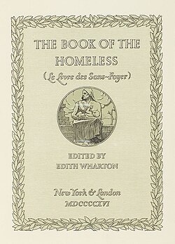
A close friendship with author Edith Wharton proved vital to the press's early success. Starting with The Greater Inclination in 1899, Wharton insisted that Merrymount handle her printing, which led to a productive relationship with her publisher, Scribner's. Updike noted that this connection proved Merrymount could compete with larger printing houses. In 1916, the duo collaborated on The Book of the Homeless, a collection of stories, essays, and art to benefit the World War I effort. This included a limited edition of 175 signed copies.
The Book of Common Prayer
In 1928, the Episcopal Church sought a revision of its Book of Common Prayer, financed by J.P. Morgan, Jr. After competing against prestigious houses like the Oxford and Cambridge University Presses, Merrymount was selected. Updike proposed two designs—one in Lutetia and one in Janson. The Dutch Janson typeface was chosen, resulting in a work released in November 1930. It is widely regarded as Merrymount's finest work and was recognized as one of the Fifty Books of the Year by the American Institute of Graphic Arts in 1931.
The Limited Editions Club
From 1930 to 1942, Merrymount printed eight exclusive titles for the Limited Editions Club, a publisher specializing in fine bindings. These books were limited to 1,500 copies per title for subscribing members. Notable works included:
- The Fables of Jean de La Fontaine (1930)
- The Brothers Karamazov by Fyodor Dostoevsky (1933)
- A Christmas Carol by Charles Dickens (1934)
- Walden by Henry David Thoreau (1936)
- Pride and Prejudice by Jane Austen (1940)
- The Education of Henry Adams (1942)
Frequently Asked Questions
What was the most significant work produced by Merrymount Press?
The 1930 Book of Common Prayer, printed in the Dutch Janson typeface, is considered the press's finest work and received critical acclaim from the American Institute of Graphic Arts.
How did Edith Wharton influence the success of the press?
Wharton's insistence on using Merrymount for her publications established a relationship with the publisher Scribner's, which validated the press as a professional entity capable of competing with larger printing houses.
What is the difference between the Merrymount and Janson typefaces used by Updike?
The Merrymount typeface was a heavy, "black" style based on William Morris's Arts and Crafts movement. In contrast, the Janson typeface represented Updike's shift toward a cleaner, more practical, and refined look.
What was the purpose of The Book of the Homeless?
Published in 1916, this collection of original literary and artistic works was created by Edith Wharton and Daniel Updike to raise funds for the war effort during World War I.
What role did the Limited Editions Club play in Merrymount's history?
Between 1930 and 1942, Merrymount printed eight high-quality, limited-run books (1,500 copies each) and the club's first hardcover prospectus, showcasing the press's ability to produce luxury bindings.