Fonts and Typefaces: The Essential Guide to Typography Design
In the world of visual communication, the terms "font" and "typeface" are often used interchangeably, but they carry distinct meanings rooted in the history of printing. Understanding these nuances is essential for anyone looking to master the art of layout, design, and digital readability.
A typeface is a specific design of characters that share a consistent aesthetic. A font, historically speaking, refers to a particular size, weight, and style within that typeface. For example, the Bauer Bodoni typeface is a design family that includes various fonts, such as "Roman 12pt," "Bold 12pt," and "Italic 12pt."

From Metal Type to Digital Files
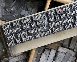
Before the digital revolution, typography was a physical craft. In traditional metal typesetting, fonts were created using physical pieces of metal or wood. Each font was a specific size and style, and a single set of type would include varying quantities of specific characters. For instance, a new font might be sold as "12pt 14A 34a," indicating it contained 14 uppercase "A"s and 34 lowercase "a"s in 12-point size.
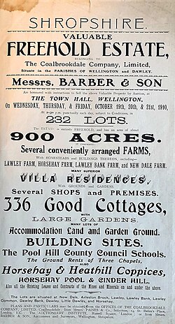
The late 19th century saw the invention of "hot lead" typesetting, such as Monotype and Linotype technologies, which allowed type to be cast as it was set. Today, in contemporary computing, fonts are distributed as digital files. Most modern fonts are scalable, meaning they can be resized without losing quality, though many digital files contain multiple weights and styles within a single package.
Key Facts

- Typeface: The overall design of a set of characters.
- Font: A specific size, weight, or style of a typeface.
- Weight: The thickness of the character strokes (e.g., Light, Bold, Black).
- Optical Size: Versions of a typeface optimized for specific point sizes.
- Scalability: A feature of digital fonts allowing them to be resized easily.
Understanding Font Weight and Style
One of the most common ways to categorize fonts is by weight, which refers to the thickness of the strokes. In 1957, designer Adrian Frutiger systematized this with the Univers typeface, using a numerical classification. Modern digital standards, such as CSS and OpenType, use a scale from 100 to 900, where 400 represents the "Regular" or "Normal" weight.
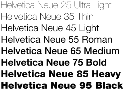
The relationship between weights can vary. In some modern digital fonts, automation allows for a smooth, continuous transition between weights. In older families, weights were drawn manually, often resulting in more distinct jumps between styles. Some fonts are "duplexed," meaning the bold and non-bold versions maintain the same character width.
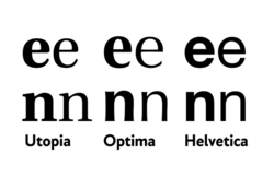
Width and Condensed Styles
Beyond weight, typefaces can vary in width. While "stretch" is rare, many families offer condensed (narrower) or extended (wider) versions. Compressing a font is a complex design task that requires slimming strokes proportionally, often resulting in straight-sided capital letters.

The Importance of Optical Sizing
Optical sizing is the practice of creating different versions of a typeface optimized for specific uses. For example, a font intended for large headlines (Display) might have thinner strokes, while a font intended for tiny captions might include "ink traps" or thicker strokes to ensure readability on low-quality paper.
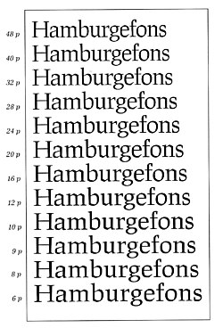
This concept was a natural part of the metal type era, as each size was cut separately. Today, it is particularly useful for serif fonts and mathematical fonts, where tiny subscripts and superscripts require specialized designs to remain legible.
Character Variants and Metrics
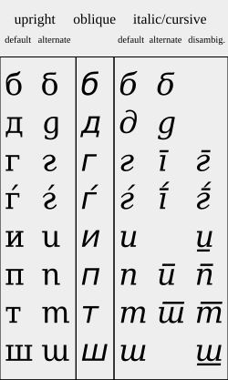
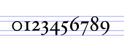
Modern digital typography offers immense flexibility through stylistic alternates. These are alternative character shapes that users can toggle to customize the look of a text. For example, a font might offer different versions of the letter "R" or specialized medieval characters for academic publishing.
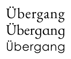

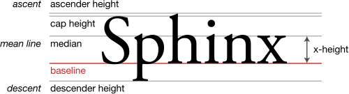
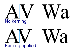
Typography also relies on precise metrics, which include measurements like kerning (the adjustment of space between individual letter pairs) and font metrics (the mathematical descriptions of character spacing and height).
Summary of Typography Classifications
| Category | Typical Point Size | Primary Use |
|---|---|---|
| Poster | > 72pt | Extremely large displays |
| Display | 19–72pt | Large headlines |
| Subhead | 14–18pt | Large sub-headings |
| Regular / Text | 10–13pt | Body copy and standard reading |
| Small Text | 8–10pt | Secondary information |
| Caption | 4–8pt | Very small annotations |
Frequently Asked Questions
What is the difference between a typeface and a font?
A typeface is the overall design of the characters (the "look"), while a font is a specific variation of that design, such as a particular size, weight, or style.
What does "optical sizing" mean?
Optical sizing refers to creating different versions of the same typeface that are specifically adjusted for different sizes—for example, making strokes thicker for very small text to improve legibility.
What are stylistic alternates?
Stylistic alternates are alternative versions of specific characters within a font that allow designers to customize the appearance of the text, such as using a more decorative "R" or a specific version of an "e".
How are font weights measured in digital design?
In digital environments like CSS and OpenType, font weights are often measured on a scale from 100 to 900, where 400 is the standard "Regular" weight and 700 is "Bold".
What is kerning?
Kerning is the process of adjusting the spacing between individual pairs of letters to ensure they look visually balanced and even.