Blackletter Scripts: The History and Evolution of Gothic Typography
Blackletter, popularly known as Gothic, is a family of scripts that defined the visual landscape of Western Europe for centuries. Originally developed as a medieval book hand, it evolved from the Gothic family of scripts into the iconic typefaces we recognize today. From the illuminated manuscripts of the 12th century to the mastheads of modern newspapers, blackletter represents a bridge between the handwritten word and the printing press.
While often confused with the Old English language, blackletter is a script style, not a language. It emerged long after the Old English period and served as one of the three pillars of Western typography, alongside Roman and Italic types.
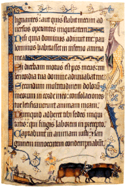
Key Facts
- Origin: Developed from Protogothic and Carolingian minuscule in the late 12th century.
- Usage: Dominant in Western and Northern Europe from the 12th to the 17th century.
- Regional Longevity: Used in Scandinavia until the 1870s and in Germany until 1941.
- Defining Feature: Characterized by lateral compression, tall narrow forms, and a "woven" appearance.
- Modern Presence: Still used in high-profile logos like The New York Times to evoke gravitas.
The Evolution of Handwriting: Textualis and Textura
In the realm of palaeography (the study of ancient writing), blackletter is closely associated with the Textualis or Textura family. The term "Textura" is derived from the Latin texo, meaning "to weave," referring to the intricate, regular pattern of the letters that resembles woven fabric.
The rise of this script was driven by the expanding literacy of 12th-century Europe. As new universities were founded, there was a growing demand for textbooks on law, grammar, and history, moving beyond purely religious texts. This necessitated a hierarchy of scripts to distinguish between luxury liturgical volumes and academic texts.
The Four Grades of Textualis
Palaeographers categorize Textualis into four distinct grades based on the treatment of minims (the short vertical strokes):
- Prescissa: Also known as Sine Pedibus ("without feet"), where strokes are cut off horizontally at the baseline rather than ending in a serif.
- Quadrata: Also known as Fracta, characterized by a square aspect.
- Semi-Quadrata: A transitional form between square and round.
- Rotunda: A rounder, more open version of the script.
Blackletter in the Age of Printing
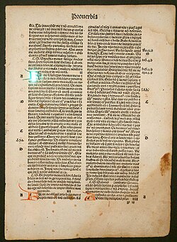
Johannes Gutenberg utilized a Textualis typeface for his landmark 42-line Bible in 1455, incorporating numerous ligatures and abbreviations to mimic the look of handwritten manuscripts. However, as printing evolved, different regional styles emerged.
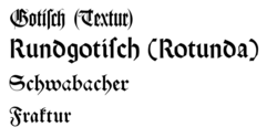
Schwabacher
Dominating Germany from roughly 1480 to 1530, Schwabacher was a more rounded blackletter. It was the primary typeface used for the works of Martin Luther and the Protestant Reformation. It is distinguished by a rounded small "o" and a unique capital "H" that resembles a lowercase "h".
Fraktur
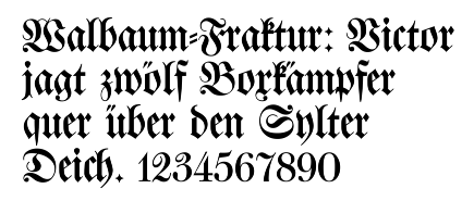
By the mid-16th century, Fraktur became the most common German blackletter. It is characterized by angular strokes on the left side of the small "o" and compound capital letters made of rounded "c" or "s" shapes. In Germany, the term "Fraktur" is often used interchangeably with "blackletter" generally.
Typography and Emphasis
Unlike modern typography, blackletter did not use bold text for emphasis. Instead, printers used Sperrung (letterspacing), where characters were spread apart to draw attention. Notably, certain ligatures remained joined even during letterspacing. Additionally, foreign words—particularly those from Romance languages or Latin—were typically set in Antiqua (Roman type) to distinguish them from the main text.
Modern Applications and Digital Encoding
Today, blackletter is primarily used for decorative purposes or to convey a sense of tradition and authority. Major publications like The Los Angeles Times and The Sydney Morning Herald use it in their nameplates to evoke the origins of the printing press. In popular culture, artists like Taylor Swift have used Textur blackletter on album art (such as Reputation) to symbolize media scrutiny and the nature of news headlines.
In the digital age, Unicode provides specific ranges for mathematical blackletter characters (U+1D504–1D537). These are intended for mathematical texts where different script styles are needed to distinguish variables. For standard text, the Unicode standard recommends using ordinary Latin code points paired with a dedicated blackletter font.
| Style | Key Characteristics | Primary Era/Use | Notable Example |
|---|---|---|---|
| Textura | Woven, square, rigid verticality | 12th–15th Century | Gutenberg Bible |
| Schwabacher | Rounded letters, more fluid | 1480–1530 | Martin Luther's works |
| Fraktur | Angular and rounded compounds | 16th–20th Century | Standard German print |
Frequently Asked Questions
Is blackletter the same as Old English?
No. While often called "Old English lettering," blackletter is a script style. The Old English language predates blackletter by centuries and was originally written in Futhorc runes or insular script.
Why was blackletter banned in Germany in 1941?
Adolf Hitler officially banned the script in 1941, claiming it was not truly German but rather "Schwabach Jew letters," and mandated the use of Antiqua (normal script) instead.
What is the difference between blackletter and Gothic sans-serif fonts?
They are entirely different. Blackletter refers to the medieval, heavy-stroke calligraphic style. "Gothic" in modern design often refers to clean, sans-serif typefaces, which have no historical relation to the medieval Gothic script.
How did printers emphasize words in blackletter?
Instead of using bold or italics, printers used a technique called Sperrung, which involved increasing the spacing between letters to make a word stand out.
What is the meaning of "Prescissa" in blackletter?
Prescissa means "cut off." It refers to a style of Textualis where the bottom of the letters (minims) lack serifs or "feet" and are instead finished with a clean horizontal cut at the baseline.