Serif Typography: History, Classifications, and Design Evolution
In the world of graphic design, few elements are as fundamental yet as nuanced as the serif. A serif is a small line or stroke regularly attached to the end of a larger stroke within a letter or symbol. While these tiny flourishes may seem subtle, they define the character, readability, and historical context of a typeface. When a font family utilizes these strokes, it is known as a serif typeface; those that omit them are categorized as sans-serif.
The terminology surrounding these styles has evolved significantly over centuries. In some typographic circles, sans-serif faces are referred to as "grotesque" or "Gothic," though the latter can sometimes refer to blackletter styles. In German-speaking regions, the term Antiqua is frequently used to describe serif types, often serving to differentiate upright roman type from italic styles.
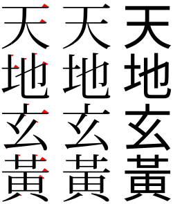
Key Facts
- Serif: A small stroke attached to the end of a larger letter stroke.
- Sans-serif: A typeface that does not include serifs.
- Four Main Groups: Serif typefaces are classified into Old-style, Transitional, Didone, and Slab serif.
- Etymology: The term "serif" is believed to be a back-formation from "sanserif."
- Historical Context: Early humanist types were modeled on the scripts of the Italian Renaissance.
The Origins of the Serif
The etymology of the word "serif" is a subject of historical interest. Early citations include the printer Thomas Curson Hansard, who used the term "ceriphs" in 1825, and Greek scholar Julian Hibbert, who in 1827 remarked on the "syrifs" or "cerefs" found in Giambattista Bodoni's type. The Oxford English Dictionary notes the first official uses of "serif" in 1830 and "sans serif" in 1841, suggesting the former may have been derived from the latter.
Major Classifications of Serif Typefaces
Typographers generally categorize serif typefaces into four distinct subgroups based on their historical emergence and stylistic characteristics.
Old-style
The earliest "humanist" roman types emerged in Italy, modeled after the handwriting of the period. These typefaces often feature an "e" with an angled cross-stroke rather than a horizontal one, and an "M" with two-way serifs. They typically present a relatively dark appearance on the page. The work of Nicolas Jenson remains highly admired, and the influential 1495 font by Francesco Griffo for Aldus Manutius led to the development of Garalde faces, which are lighter on the page and became an international standard across Europe from the 1530s.
![Adobe Garamond, an example of an old-style serif[a]](/images/1a/42/1a4218d4eef9b455271e52c76b187de2b19b6a1880bc6da38c09382ec510b326.webp)
Transitional
Transitional typefaces represent a middle ground in typographic evolution. While the term is sometimes considered "nebulous" by scholars—as it can include both historical faces like Baskerville and later 19th-century reimaginations—it generally describes styles that bridge the gap between Old-style and the high-contrast Didone styles. These faces often feature more refined, sharper strokes than their humanist predecessors.

Didone
Also known as modern faces, Didone typefaces are characterized by extreme contrast between thick and thin strokes. This style emerged as a highly stylized evolution of typography, often used for high-impact display purposes. The work of Giambattista Bodoni is a primary example of this category.

Slab Serif
Slab serifs are defined by thick, block-like serifs. These can range from highly geometric designs to less geometric, more organic versions. Because of their heavy weight, they are often used for headings and display text where visibility is paramount.


Summary of Serif Classifications
| Classification | Key Characteristics | Historical Context |
|---|---|---|
| Old-style | Angled cross-strokes, humanist influence, darker appearance | Early Italian Renaissance |
| Transitional | Bridge between old and modern, refined strokes | Post-Renaissance evolution |
| Didone | High contrast between thick and thin strokes | Modern era evolution |
| Slab Serif | Thick, block-like serifs | Later emergence, often for display |
Frequently Asked Questions
What is the difference between serif and sans-serif?
A serif typeface includes small decorative strokes (serifs) at the ends of the main letter strokes, whereas a sans-serif typeface does not include these extra lines.
Why is the term "Transitional" sometimes debated?
The classification is considered somewhat vague by some experts because it can include a wide range of typefaces, from historical designs like Baskerville to 19th and 20th-century revivals of older styles.
What are Garalde typefaces?
Garaldes are a subset of serif typefaces that descend from the influential 1495 font cut by Francesco Griffo. They tend to feature a level (horizontal) cross-stroke on the letter "e" and were widely spread throughout Europe starting in the 1530s.
What does "Antiqua" mean in typography?
In German usage, Antiqua is a broad term used for serif typefaces, similar to how the term "roman" is used in English to distinguish upright type from italics.
Are there serifs in other writing systems?
Yes. For example, in Japanese, the analogs of serifs are known as uroko, which literally translates to "fish scales."